An interview with WHYWHYNOT
WHYWHYNOT is an interdisciplinary collective of eight designers and researchers, establishing a collaborative network focused on various societal, political, ecological, and technological phenomena shaping our world. Working together, they combine their individual proficiencies to create distinctive outcomes for spatial design, printed matters and artistic research projects. WWN consists of Felix Bell, Léa Cadieux, Gaia D’Arrigo, Hannah Kansy, Nick Monro-Meares, Sebastian Quijada Link, Julia Urreaga Aizarna, and Louisa Wolf.

he design of the catalogue and the graduation show were one cohesive unity, can you speak about how this might have changed your overall strategy and how it might have changed your design processes?
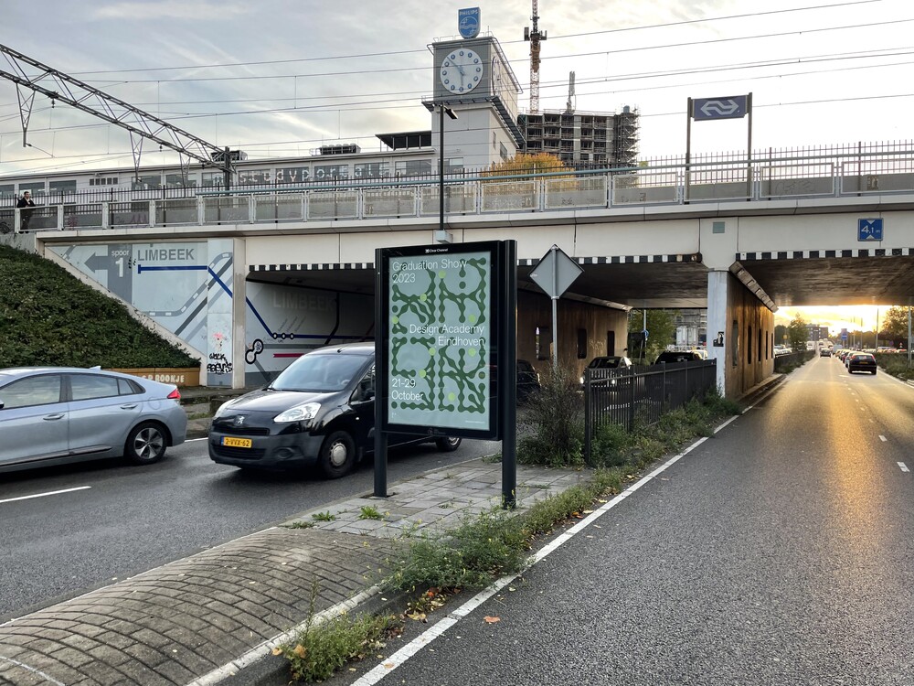
WHYWHYNOT: This one cohesive unity was something which was asked by Design Academy Eindhoven from the very beginning of the project, they wanted this year (2023) to have a unified visual identity for the catalogue, campaign and wayfinding. Given the scale of the graduation show and the fact that we exhibited there the year before, we knew that the visual identity had to be versatile and able to adapt to many different formats, from digital to print. This cohesion would allow us to tie all the elements of the graduation show together – from the physical exhibition to the digital space and social media to the graduation catalogue.
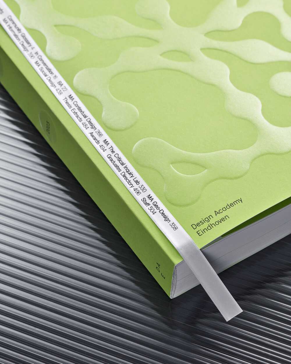
With this in mind, we initiated our first mind-mapping sessions. Our goal was to ensure that the visual identity was strong but didn’t overshadow the projects; they should remain the central focus. We aimed to unify everything through a cohesive visual language, and over three months of concept development, research, meetings, experimentation and reflection sessions, we landed on our concept. It was to develop a graphic system based on a modular font of connecting circles. The identity aimed to capture the fluid interconnections between project themes, the individuals involved, and the materials they employ. This modularity allowed the identity to be versatile and flexible. Having this graphic system as a foundation, we were later able to split into smaller teams that still worked together to ensure that the visual elements were consistent. This design process helped us and was very beneficial when working on such a large-scale project with so many people involved.

You have taken a very democratic approach to this year’s catalogue and flyers and have included different student initiatives as well as offering graduates the opportunity to define what their practice is or how they see themselves professionally within the catalogue. Can you speak about the intent behind this approach?
WWN: This ties back to the idea we followed throughout the initial phase, we felt like the graduates, their projects and their practice should be the centre of attention. We wanted to give them a platform in which they could define themselves and their practice more in-depth and on a more personal and also professional level. As a result, we gave every graduate the chance to include their pronouns, non-Latin alphabet names, and how they define their profession on their spread in the graduation catalogue. The responses, particularly those related to how individuals defined their profession, proved to be incredibly intriguing and showed a broad range of perspectives. This aspect added a layer of diversity, expanding the spectrum of design disciplines beyond the departments and studios at DAE and provided a more comprehensive and inclusive representation of the design landscape within the graduates and their practices.
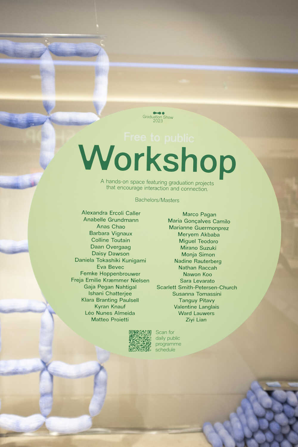
We also worked closely with Dr. Naomi Bueno de Mesquita, Professor of Design and Social Justice at DAE, who helped us understand these design landscapes through her ongoing research at the academy. This exchange with her is part of the graduation catalogue in the form of an interview. Additionally, we were also in close contact with the student initiatives and Pete Fung, Community Organiser at DAE, who gave us insights into the extracurricular activities that are inherently intertwined with the graduates and their projects. While presenting the graduates’ work, it was important for us to emphasise the community aspect within the school and how student initiatives such as the “B-Zar Material Bank” have significantly influenced some of the outcomes of the projects. To make these initiatives more tangible, we included an overview of the student initiatives and some personal insights into their activities in a visitor guide for the graduation show.
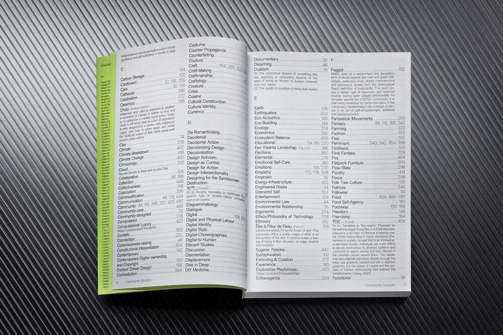
This inclusive and community-orientated approach is also reflected in the “Community Glossary” of the catalogue. We asked each graduate to name three words that describe their project, whereby non-Latin alphabet words and expressions could also be used. This glossary gives the reader an overview of the more than 200 projects and also shows how differently these terms are reflected in the projects. This feature also perfectly aligned with our visual concept of illustrating the fluid connections within the project themes.

You are a collective of eight recent alumni, and share a studio in Rotterdam - how was this collaboration like? What are some of the highlights and challenges?
WWN: Adding some context to our group, WHYWHYNOT comprises eight designers, from different Master departments of DAE. Having shared the Master’s journey for two years, we decided to stay in the Netherlands and establish a shared space. This space serves as a hub for our collaborative efforts, offering both independence and collective support. Our studio space in Rotterdam is the physical component of this.
Working with a diverse group of designers, each bringing different skills, ideas, and preferences to the table, is undoubtedly enriching. However, it can also present challenges. We don’t work hierarchically, which leads to a lot of questions: How do we make decisions? Who takes on which tasks? Who is responsible for what? How to deal with different opinions? This project served as a valuable experience not only in the power of collaboration but also in navigating the collective process of designing together. Looking back at the beginning of the project and the first mind-mapping sessions, it was really impressive to see how all the different ideas came together and how they grew and refined through mutual exchange and collective processes, ultimately leading to new insights. Given that each one of us has their unique practice, this diversity of perspectives enabled us to include a wide spectrum of aspects in the project. Collaborating needs time, which is something that is not always easy, but definitely required.
Being a large group of designers also allowed us to create sub-groups that would focus more on particular aspects of the commission. Even if the groups were quite fluid and we encouraged each other to give inputs in several aspects, we divided the work towards the production between the design of wayfinding, screen animations, campaign and catalogue, as each of them required a particular focus in certain media.
One of the most impactful moments was seeing the culmination of months of work finally be revealed in the graduation show itself. Experiencing the activation of all the materials was truly unique—seeing the posters in the streets of Eindhoven, spotting visitors carrying the green tote bags, watching the animation at the entrance, and meeting graduates wearing the pin. Since we graduated a year before, some of the 2023 graduates were our friends, to be able to create something that we were proud of and that would be part of their memories as a designer was something special to us whilst also being the biggest challenge.
Another highlight was the moment we signed the first sheet of the graduation catalogue at the print facility in Belgium, signaling the start of printing thousands of copies. It brought the project to life in a tangible way, a very rewarding moment.
